We love a good renovation! Especially one with a great concept. Anytime a client comes to us with the two words, collection and concept we know it will always turn out wonderful!
We recently completed a kitchen renovation in a Franklin home that not only aesthetically nailed our client’s vision, but also allowed them to have a kitchen that functioned so much better!
Here is where we started:
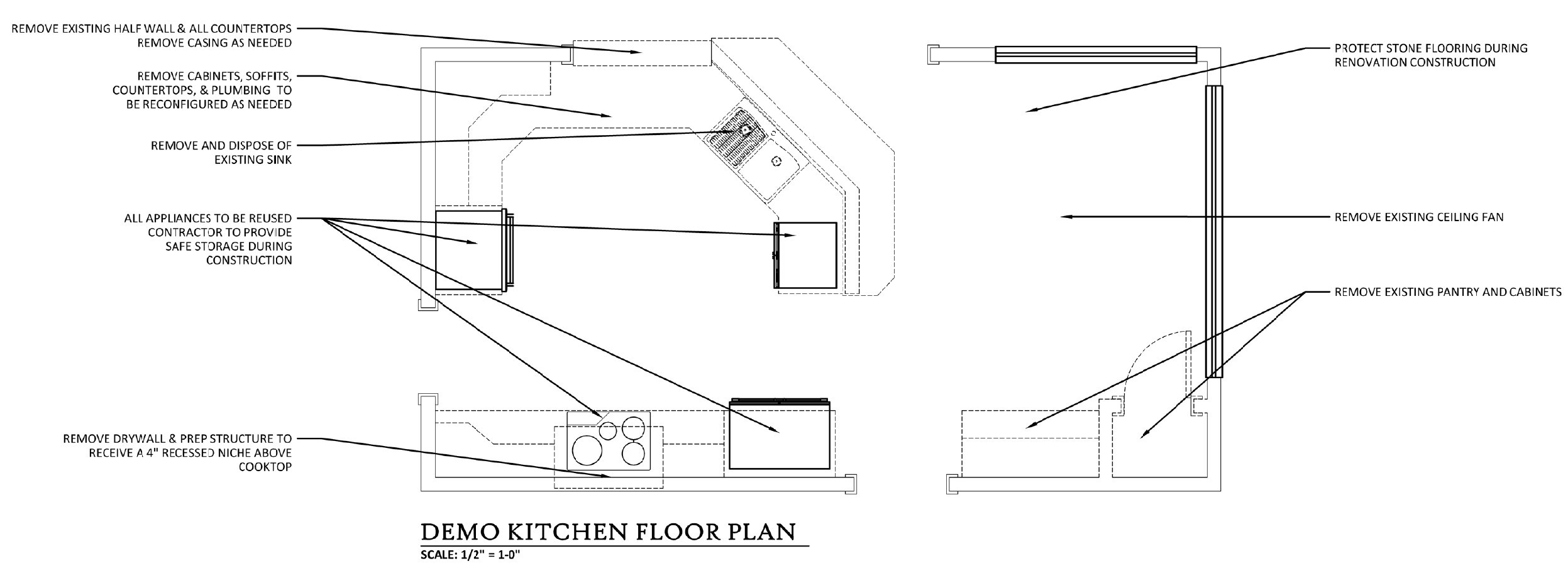
Demolition Plan
The existing kitchen layout was separated from the adjoining family room. By a half wall, and an angled peninsula that contained the sink and dishwasher. While the existing peninsula allowed for bar height seating, it was only a whopping 30” from the exterior wall creating a bottlenecked entry from the family room into the kitchen. It was almost impossible for anyone to pass through if the barstools were in use.
Other downside to the existing kitchen were the wasted cabinet space on the upper cabinets. And see that hood above the cooktop? It was fake. This house has a down draft so that was merely for looks only! Lastly, in the corner of the breakfast area a walled in pantry and a not-so-much-used desk area. Guided by a very distinctive vision we rounded out all the “problem” areas. We took out all of these negatives, and reconfigured the layout to work better with the family room and had a very distinctive look we were going for.
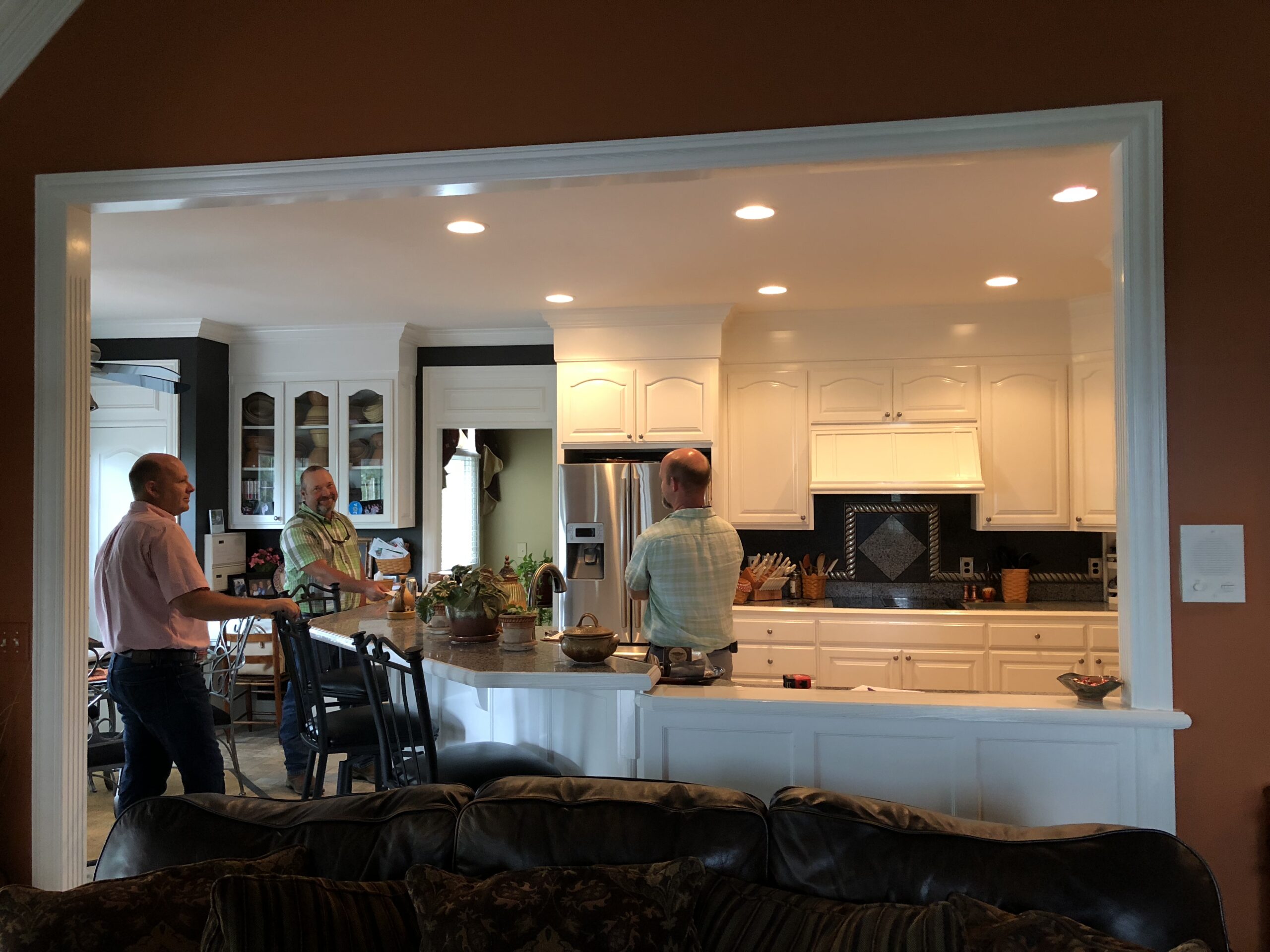
Existing Kitchen Photo
Cue the concept: Old Timey General Store
Cue the collection: Antique Stoneware Bowls
Our client loved the idea of having a center island that replicated a general store counter. We were really in love with getting the chance to recreate that timeless glow of old worn wood! We also knew that we needed to provide a dedicated area for their stoneware collection so it could really shine and become a focal point of the breakfast nook area.
For our favorite dish collecting eye candy check out @jesselauzon
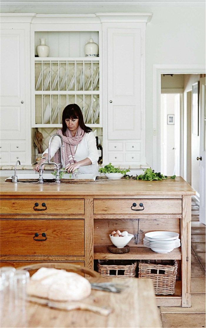
Concept Image Via Pinterest
Other areas of the kitchen we resolved by adding additional cabinet storage. By removing the soffit above the existing cabinets and extending the new cabinets to the ceiling it gave us extra storage and now the ceilings soar! We took the area above the cooktop and while it still looks like there is a hood vent there, we actually now have fabulous hidden task lighting and maximized the storage above it as well! We also removed a strange unusable corner cabinet with countertop shelving that housed a vent pipe. While we could not get rid of the pipe, we minimized it as much as we could and tiled around it so that there was no interruption to the countertop worksurface. The existing black cooktop now fades into the countertop with us using Caesarstone’s Piatra Grey quartz.
Lastly we added a few additional touches nodding to our general store concept. The recessed niche behind the cooktop has ceramic tiles by Specialty Tile that replicate an antique tin ceiling. We paired this accent with a subway tile from Traditions in Tile that was made with pottery in mind! Perfectly duplicating our antique stoneware bowl surface! And our new breakfast nook breakfront built in has perfectly patinaed bin pulls adding one more layer to our concept.
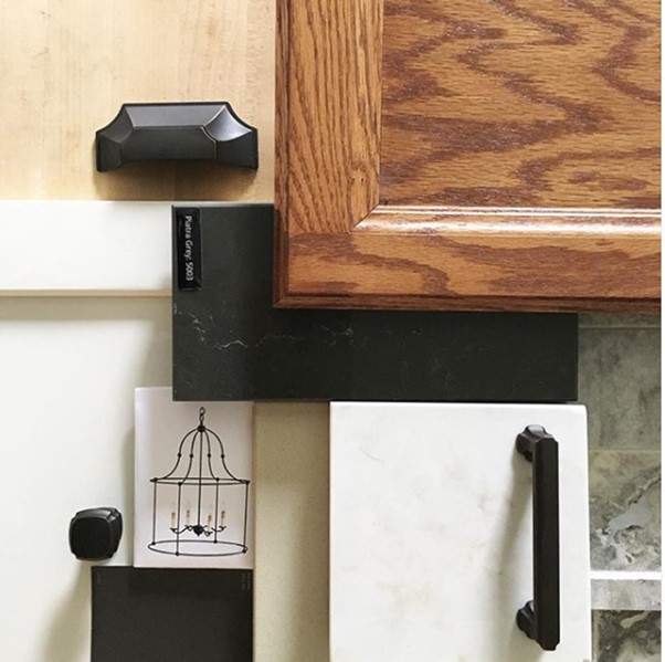
Design Presentation Materials / https://www.instagram.com/p/Bm3s0dnBx8M/
With “styles” down, it was on to the actual function of the kitchen! We worked closely with our client to determine doors verses drawers. Where items would be stored and what would be accessed the most. In the island we placed the sink, dishwasher and trash/recycle. The placement of our new island allowed us to really open the kitchen up to the family room and add…you guessed it! Bar seating that actually works!
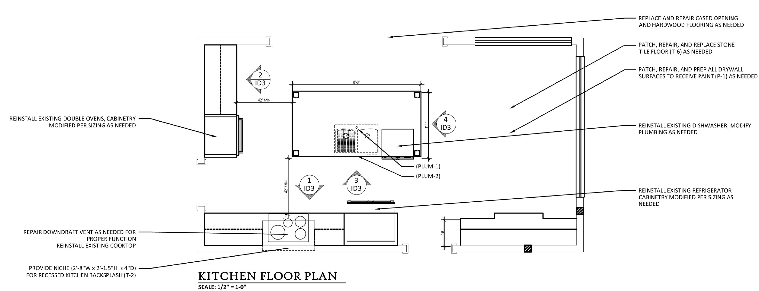
The result:
An updated open floor plan, light and bright, with counter bar seating for the entire family!!
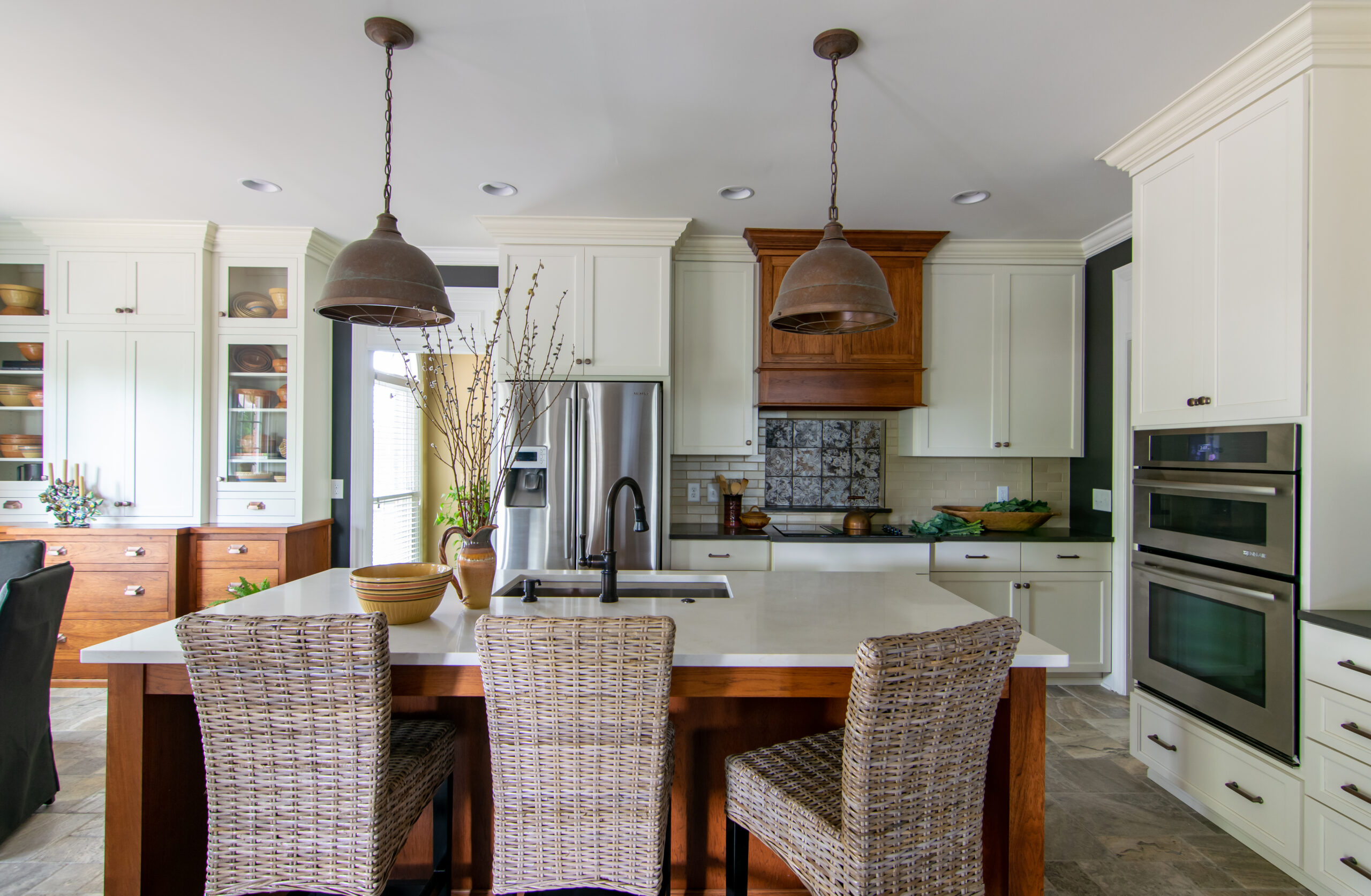
General Store Inspired Kitchen Design / Photo By Tiffany Clapp
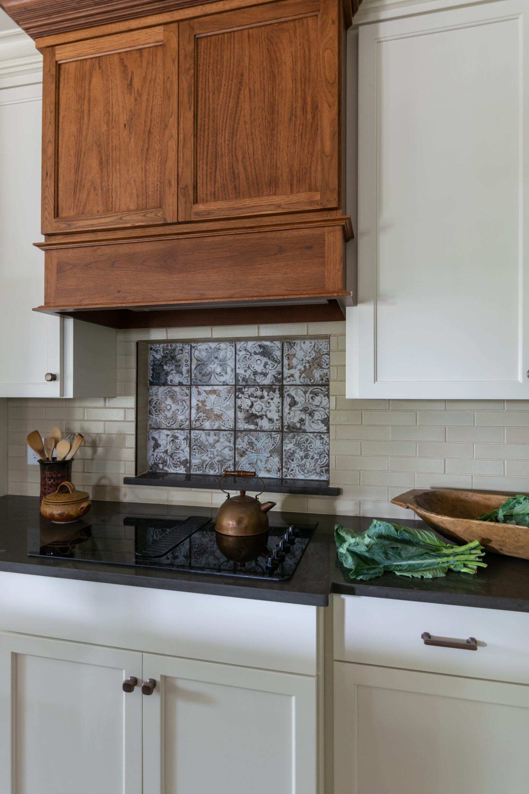
Recessed Niche at Cooktop / Photo By Tiffany Clapp
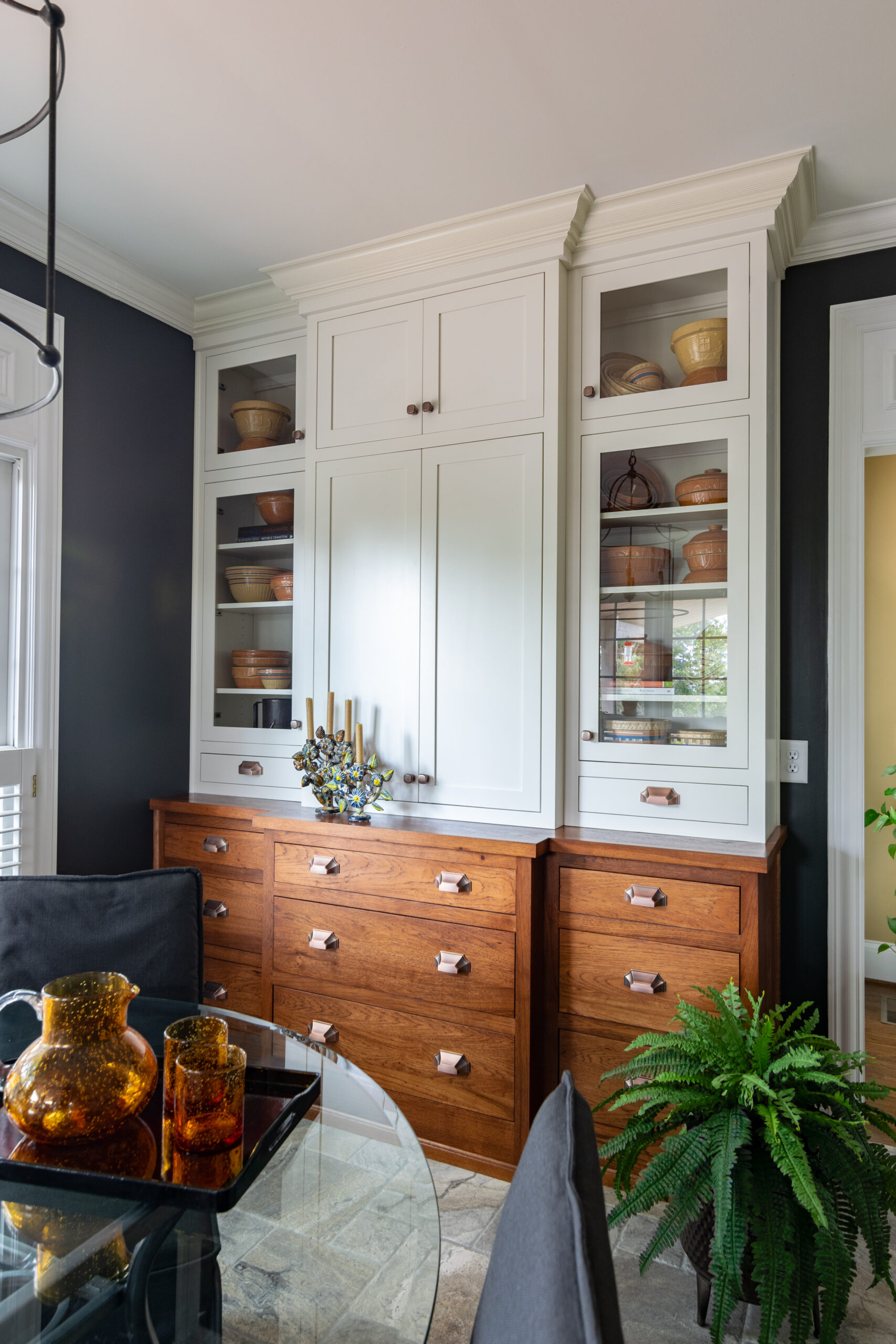
Custom Cabinetry Breakfront Built In / Photo By Tiffany Clapp
While we love this breakfront for allowing us to showcase our client’s collection we love it even more for the functional storage it provides! The drawers hold napkin rings, placemats and linens while the center doors allow for additional servingware storage.
Hope you have enjoyed our tour of a general store inspired kitchen renovation. We wish you all happy collecting!!
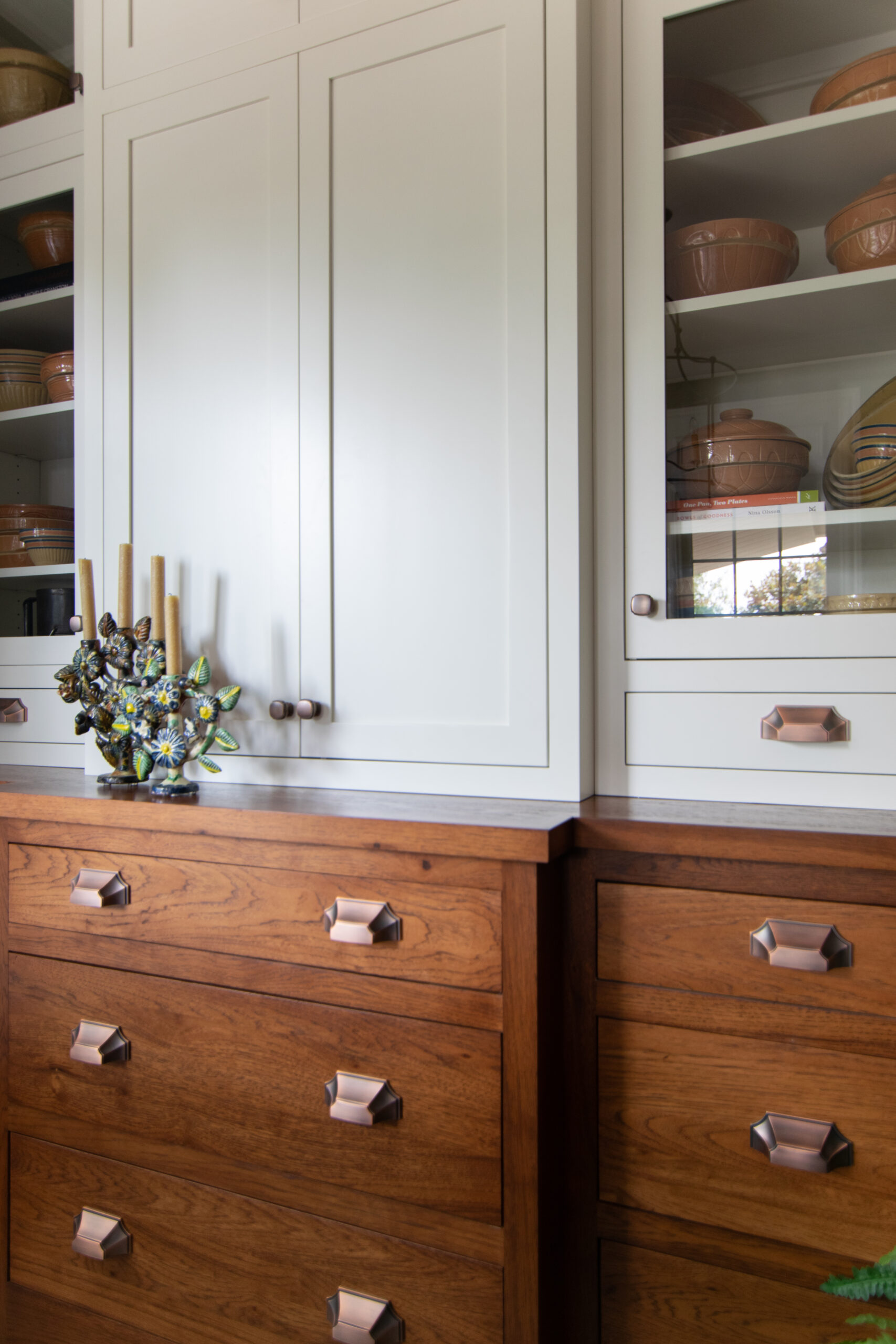
Storage Details / General Store Inspired Breakfront / Stoneware Bowl Collection / Photo By Tiffany Clapp
