Color Wheel
To understand color theory, you first need to become familiarized with the color wheel. In the mid 1600s, it was Sir Issac Newton who created the first color wheel based off his light and prisms experiments. Although some of the same basic principles still apply, the wheel we use today looks a little different. Developed by Johannes Itten in the 1800s, the color wheel that most of us are familiar with contains 12 colors based on the three primary colors.
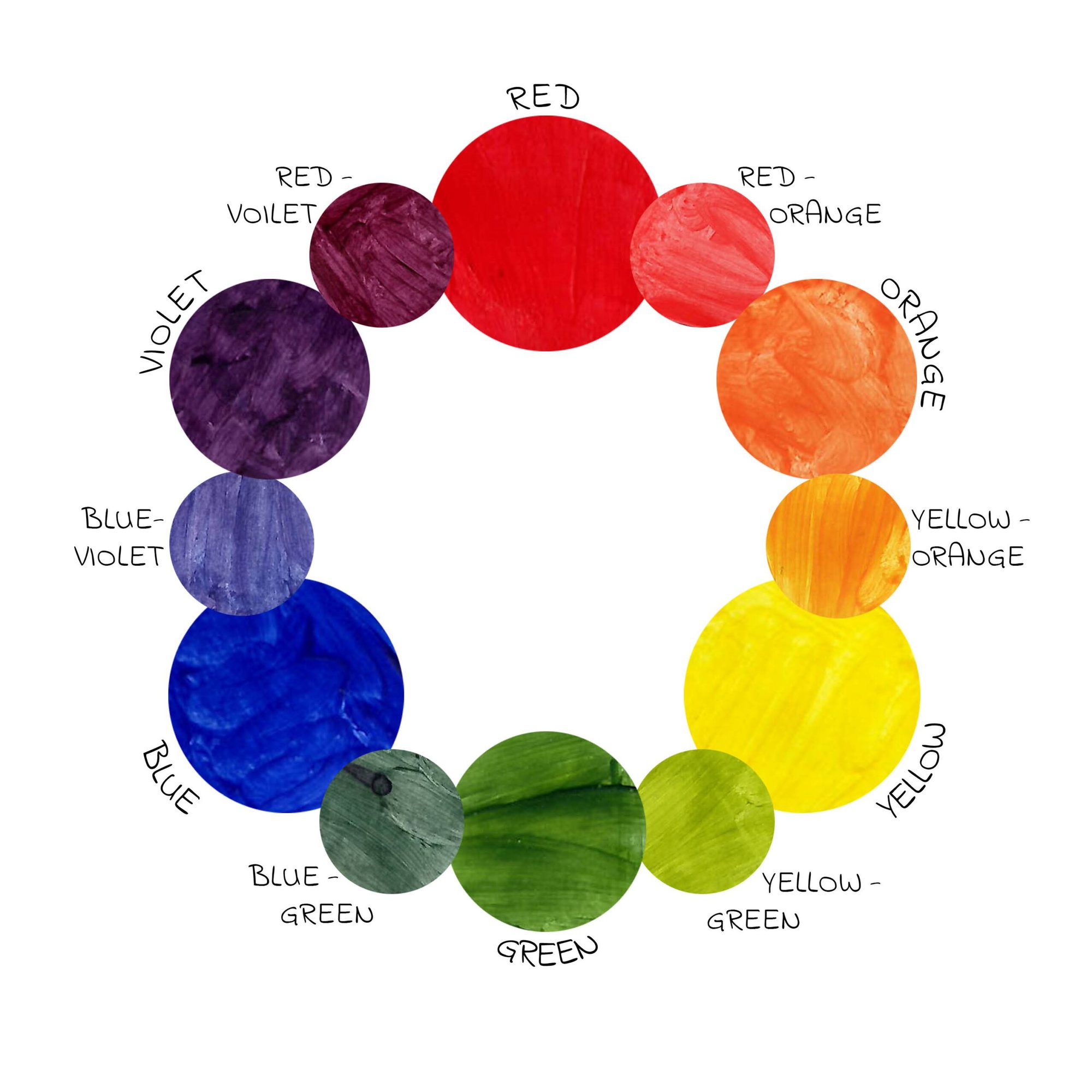
Color Wheel
- Primary Colors: red, blue, and yellow. Cannot be made from mixing other colors.
- Secondary Colors: orange, purple, and green. Can be made by mixing the primary colors together.
- Tertiary Colors: The six shades that can be made from mixing primary and secondary colors.
We all know there are more than just 12 colors. By mixing different amounts of color or by adding white, black, or gray, there are an endless number of possibilities.
- Tint: The act of lightening a color by adding white to it.
- Shade: The act of darkening a color by adding black.
- Tone: Slightly darkening a color by adding gray.
Color Theory
Color theory uses both science and art to create a logical structure on how best to use color. The color wheel provides a visual representation of which hues seamlessly combine, mix, or contrast through different color schemes.
Complementary
A complementary color scheme utilizes two colors opposite of each other on the color wheel such as yellow and violet or in the image below, red-orange and blue-green. This bold contrast will always include one warm and one cool hue.
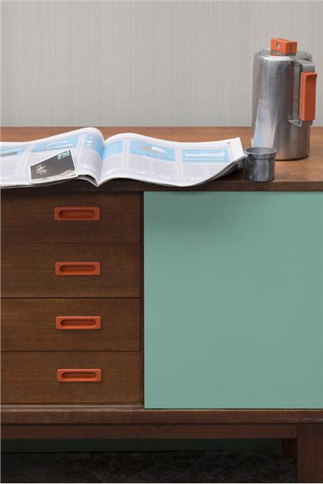
This vibrant sideboard includes the Farrow and Ball paint colors
Arsenic 214 and Charlottes Locks No. 268 in Estate Eggshell.
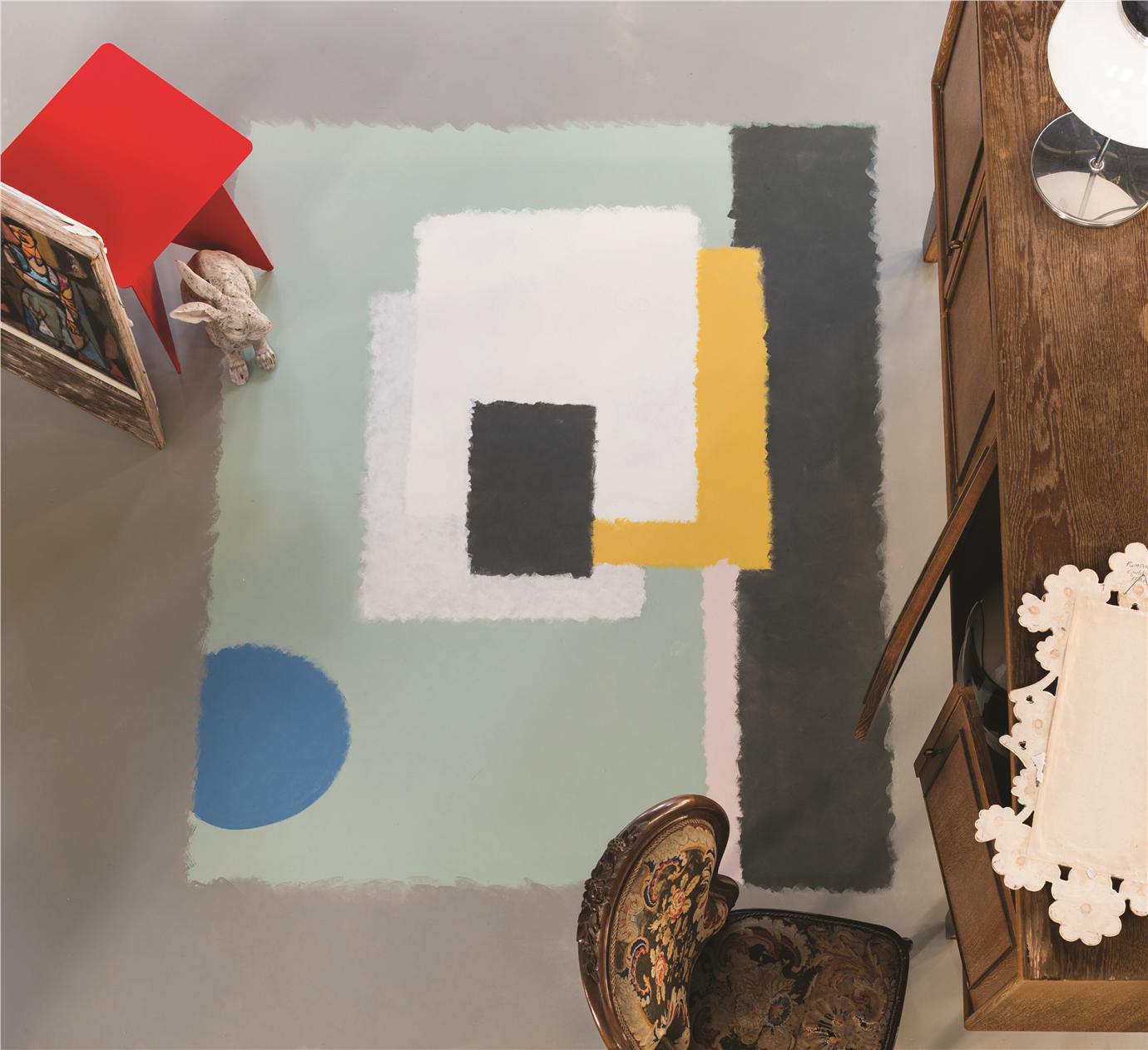
Split Complementary
A split complementary color scheme includes three colors, a base color paired with two secondary colors. Beginning with the base color, you find its compliment and then use the two colors on either side of it.
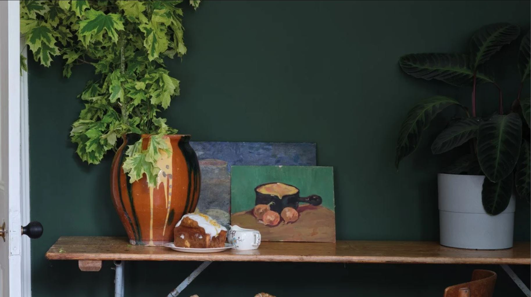
The red-orange vase pops off the blue and Duck Green
No. W55 wall paint from Farrow and Ball.
Analogous
An analogous color scheme refers to the use of consecutive colors on the color wheel. For example, in the photo below, there is yellow, yellow orange, orange, and red orange.
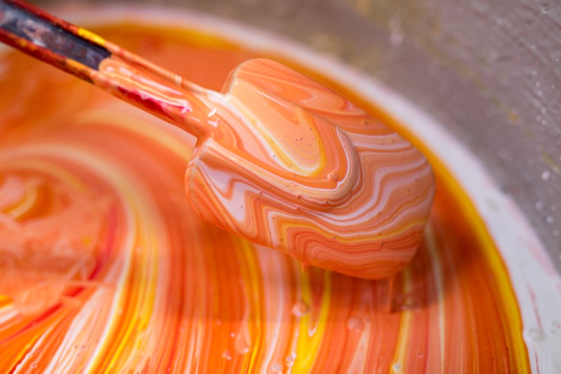
Farrow and Ball paint being mixed.
Triadic
A triadic scheme is comprised of three hues that are evenly spaced on the color wheel. The most basic combinations include the three primary colors or the three secondary. Below is the primary color scheme include red, yellow, and blue.
The red stool nicely accents the Farrow and Ball
paint colors Bouche No. 223 and Cook’s Blue No. 237.
Tetradic
The tetradic, also known as the rectangle schemed, is formed using four colors in a rectangular shape on the color wheel. Essentially you are combining two pairs of complimentary colors.
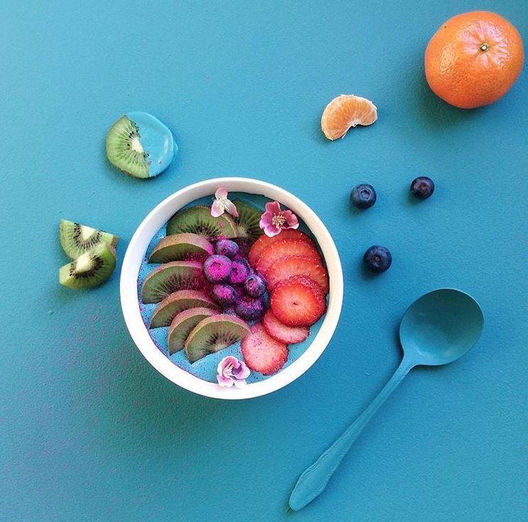
I love the way the colors of the fruit pop off the background paint
Vardo No. 288 from Farrow and Ball.
Square Color Scheme
Similar to the tetradic scheme, the square scheme consists of four colors. The four colors are evenly spaced on the color wheel.
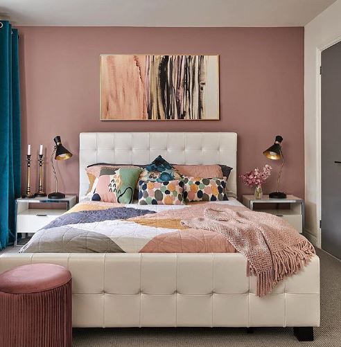
Farrow and Ball’s Sulking Room Pink No. 295 is
combined with yellow-orange, green, and blues.
Color Psychology
Color psychology is defined as the study of how color can affect someone both physically and mentally. For example, red is thought to raise blood pressure and even cause anger while blue is believed to produce a calming effect. Although this can be subjective depending on different age groups, cultures and religions, color psychology is often used in company branding and marketing, fashion design, and interior design.
Warm Colors
Warm colors, or saturated colors, include red, orange, and yellow. In general, these hues are thought to induce excitement and activity. Below are more terms and ideas often associated with warm colors.
- Red – passion, love, anger, rage, power, bold, youthful
- Orange – happiness, creativity, sunshine, warmth, friendly, cheerful
- Yellow – sunshine, confidence, warmth, optimism, overuse can cause negatives like lack of focus and frustration
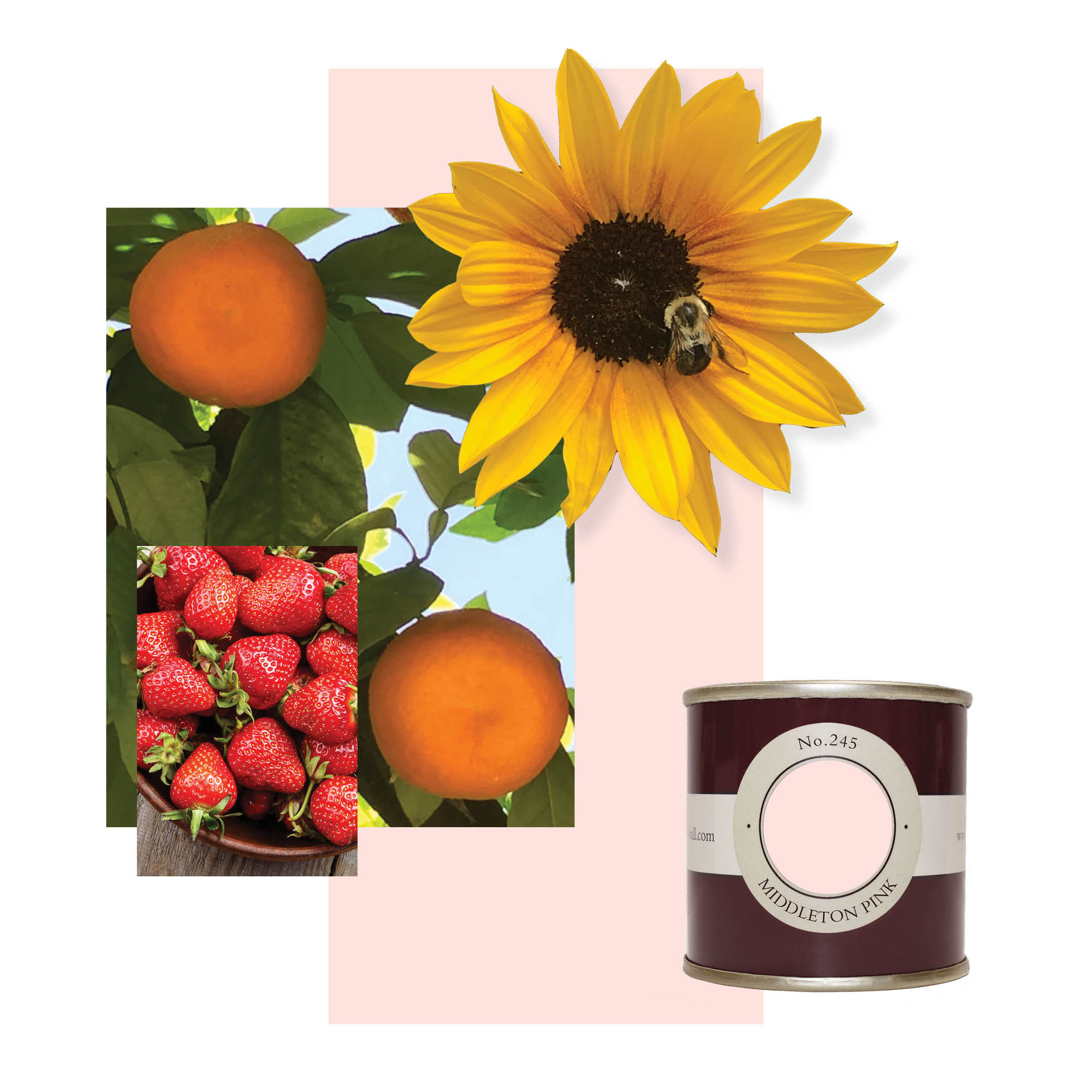
Warm Color Scheme
Cool Colors
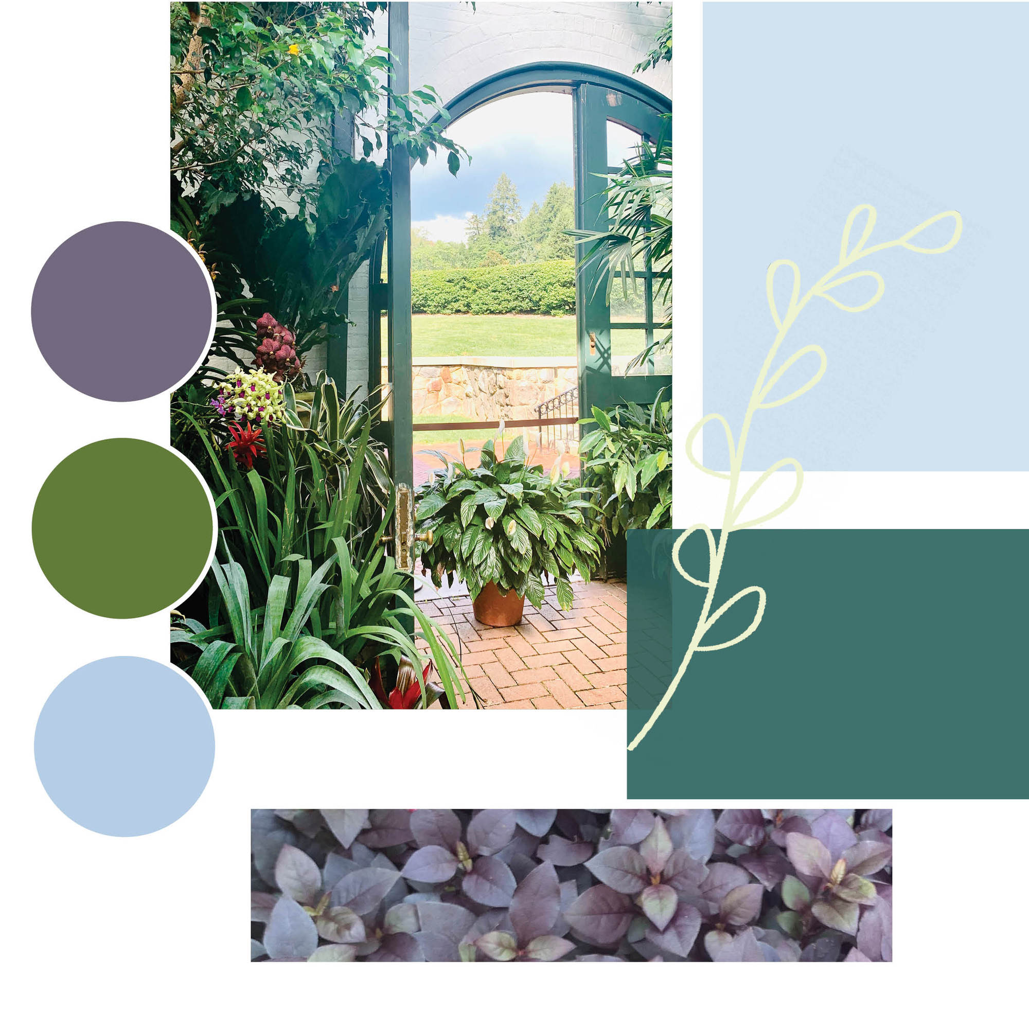
Green, blue, and purple are all cool hues that are thought to invoke a sense calm but can also be tied to sadness. See below for more color associations.
- Green – nature, health, vitality, growth
- Blue – calming, sadness, masculinity, professionalism, strength, trust
- Purple – royalty, luxury, wise, creative
Cool Color Scheme
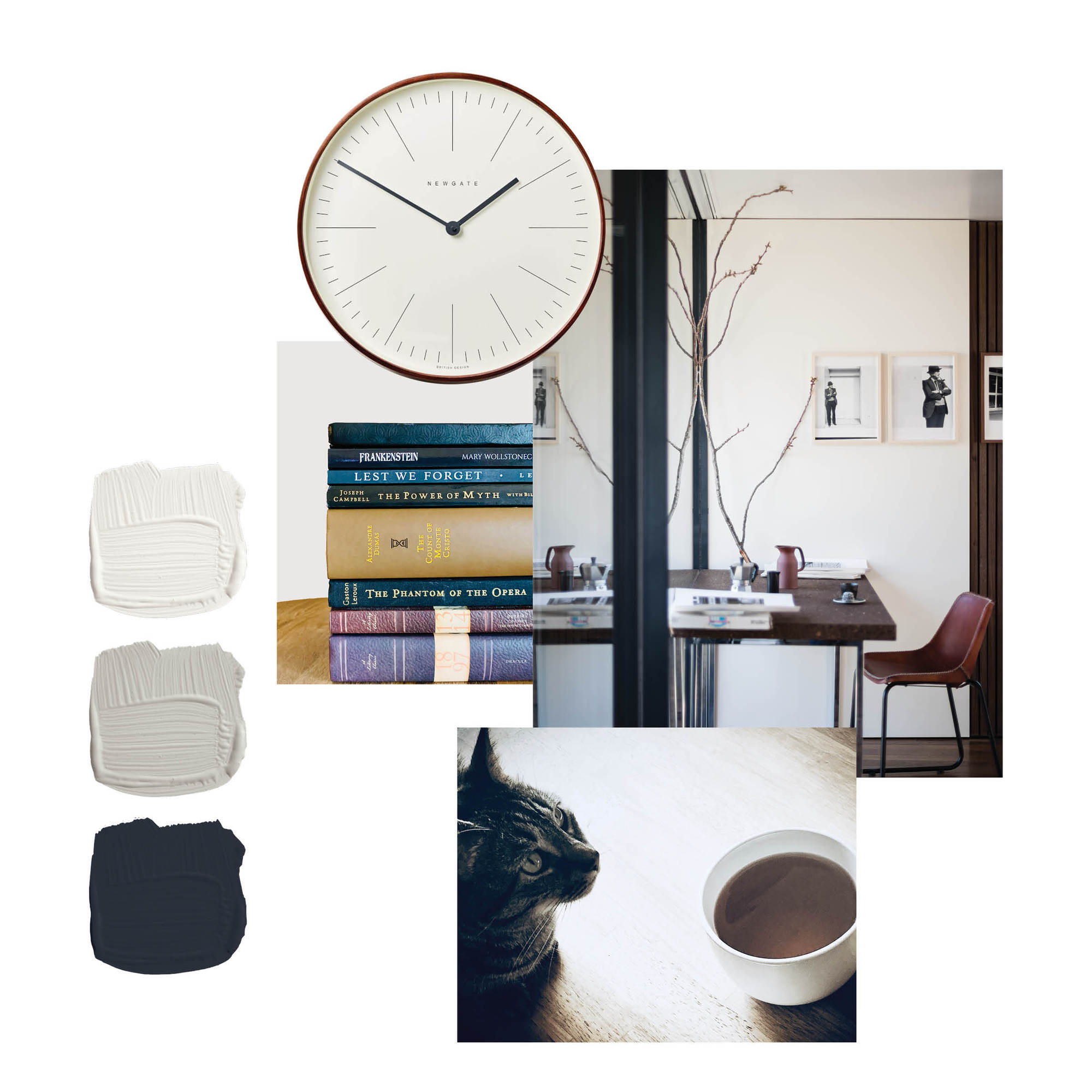
Neutral Colors
Neutral colors include black, white, brown, and gray. Although they emit a sense of sophistication, that is where the similarities end. Read more about it below.
- Black – very mixed, power, mystery, aggression, evil, grief
- White – purity innocence, light, safety, brilliance, cleanliness
- Brown – thought to stimulate appetite, high quality, comfort, friendly, approachable, wholesomeness, nature, organic, outdoors, agriculture
- Gray – timeless and practical, emotionless, moody, dull, dirty, knowledge, wisdom
Neutral Color Scheme
To read more about Farrow and Ball click here!
Love this blog!! Karen
Well done Taylor!! Great blog!