Here are a few movies I’ve recently watched with breathtaking design.

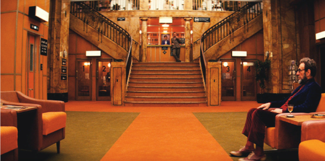
1960’s Design
Released: 2014
Director: Wes Anderson
Production Designer: Adam Stockhausen
Set Decorator: Anna Pinnock
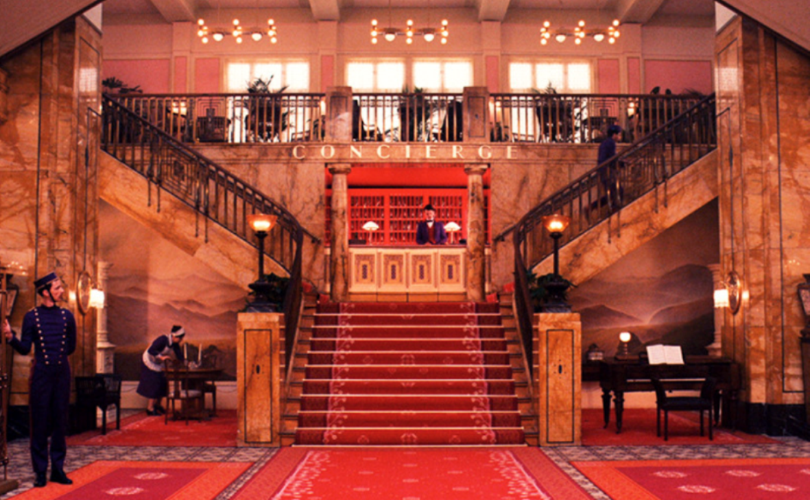
Wes Anderson, known for his careful attention to detail, once said, “usually when I’m making a movie, what I have in mind first, for the visuals, is how we can stage the scenes to bring them more to life in the most interesting way, and then how we can make a world for the story that the audience hasn’t quite been in before” (Radish). Although the sets were made from scratch, inspiration for the designs were derived from real-world places. The site of the hotel was a department store built in 1912. The converted building held production offices on the top floors, smaller sets buried within the building, and the rest was transformed into The Grand Budapest Hotel. According to Stockhausen, one of the most immense challenges of the movie was the flashback aspect where they had to transition the hotel from two different time periods. When first being introduced to the hotel, it is the 1960s, and the hotel is less than grand with plastic, wood veneers, fluorescent light panels, and a green and orange color palette.

1930’s Design
Moulin Rouge!
Released: 2001
Director: Baz Luhrmann
Production Designer: Catherine Martin
Set Decorator: Brigitte Broch
Baz Luhrmann and Catherine Martin are a powerhouse couple who have collaborated on several movies. They are from Australia, which is where they filmed Moulin Rouge!. Although the movie is said to have taken place in Paris, all the scenes were filmed on sound stages. The visual effects used were implemented in order to highlight the story’s created world, not creating a world of its own.
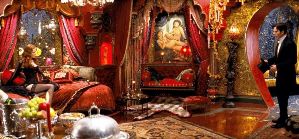
Red Curtain Cinema is a concept developed by Baz Luhrmann meaning an amplification of cinema, which rather than depicting everyday life, is meant to entertain and captivate the audience. Although Luhrmann implemented Red Curtain Cinema, the Moulin Rouge is based on a real place that first opened in Paris in 1889. One of my favorite set designs takes place within a three-story, steel frame, paper-maché elephant containing the protagonist, Satine’s red room. Located in the stomach of the elephant, the room is designed as an Arabian-themed gentlemen’s club containing lavish fabrics, ornate furnishing, and velvet draperies.

In this scene, Satine is attempting to seduce Christian, a young writer, whom she believes is the Duke. There is so much going on in this scene, I don’t know where to look first!
Titanic
Released: 1997
Director: James Cameron
Production Designer: Peter Lamont
Set Decorator: Michael D. Ford
Whenever I think of the movie Titanic, I flashback to memories of sitting on the piano bench by mom as she plays “My Heart Will Go On”; this was and still is her favorite song to play. Titanic is a beautiful love story, but what some tend to forget, is that this was a real life tragedy. James Cameron and Peter Lamont dedicated a vast amount of time researching to make sure they were portraying the scenes and characters with as much historical accuracy as they could at the time the film was made over twenty years ago.
Using blueprints of the original RMS Titanic, the movie version was only ten percent smaller. The interior of the ship was built just as monumental. A significant feature of both the original ship and movie version was the grand staircase, which can be seen throughout the movie. The solid wooden stairs contains wrought iron banisters in the Louis XIV style. The newel posts feature high-relief panels with pineapple finials. At the bottom of the stairs, on the central newel post, there is a bronze cherub holding a torch. As one reaches the landing, there are wood carvings surrounding a clock. During the final scene of the movie, this clock is seen stopped at the exact time the Titanic sank. Above the stairs, is a wrought iron and glass dome which allows for natural light to enter the space. Art Director Martin Laing explained that they were not building a set, but rather were building the stairs as how they were built on the Titanic in 1912. Like the real Titanic, when the ship sank in the movie, it destroyed the set meaning the director only had one shot to make sure the scenes were captured perfectly.
If you are a history fan, I highly recommend watching Titanic: 20 Years Later with James Cameron. This documentary delves into the history of the ship, how closely the movie came to portraying it as well as introduces you to some of the decedents of those on the Titanic in 1912.

In the photo to the left, you see Jack ascending down the staircase to have dinner with the first class passengers. On his way down, he admires the clock on the landing which is where he later has Rose meet him.
Right Photo Credit: thevintagenews.com
This photo is from the Olympic which was Titanic’s sister ship. There are no original photographs of the grand staircase from the Titanic.
A few other movies with noteworthy production design include:
- La La Land
- Alice in Wonderland
- Marie Antoinette
- Lucky Number Slevin
- Pirates of the Caribbean
- Chicago
- The Royal Tenenbaums
- American Psycho
- Crouching Tiger, Hidden Dragon
- Sleepy Hollow
- Cleopatra
- Breakfast at Tiffany’s
All are worth checking out!
